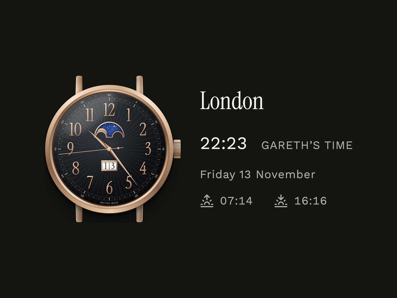
There are considerably easier ways to display the time on a website. Four numbers separated by a colon will usually do the job, perhaps accompanied by a city name if you're feeling particularly adventurous. But I've always had an appreciation for mechanical watchmaking, and the idea of introducing a beautifully detailed, functioning timepiece to my website was too appealing to resist.
What began as an exploration of how I might display different time zones became something rather more involved: a custom-designed digital watch with sweeping hands, a mechanical-style date display, astronomical sunrise and sunset information and, most importantly, a working moonphase complication.
The result now lives in the footer of my website and forms a more prominent part of my Enquire page, where visitors can explore the time in different parts of the world. It's a small, rather personal addition to the experience, but one that allowed me to bring together several things I particularly enjoy: watch design, visual detail, technical problem-solving and the satisfaction of making something work exactly as intended.
It also gave me a wonderful excuse to spend rather more time studying the finer points of traditional horology.
Taking inspiration from the watchmaker's bench
I've always found mechanical watches fascinating, not simply because of their appearance, but because of the extraordinary relationship between engineering, design and human ingenuity that goes into making them.
A traditional watch is an exercise in precision, but there's also something wonderfully expressive about it. The proportions of the case, the character of the numerals, the finishing of the hands and the way light moves across the dial all contribute to its personality. Sometimes the most captivating details are those that reveal themselves gradually, rewarding somebody who takes the time to look a little closer.
I wanted to capture some of that character in a digital format, rather than produce another familiar clock interface with a decorative watch face placed behind it.
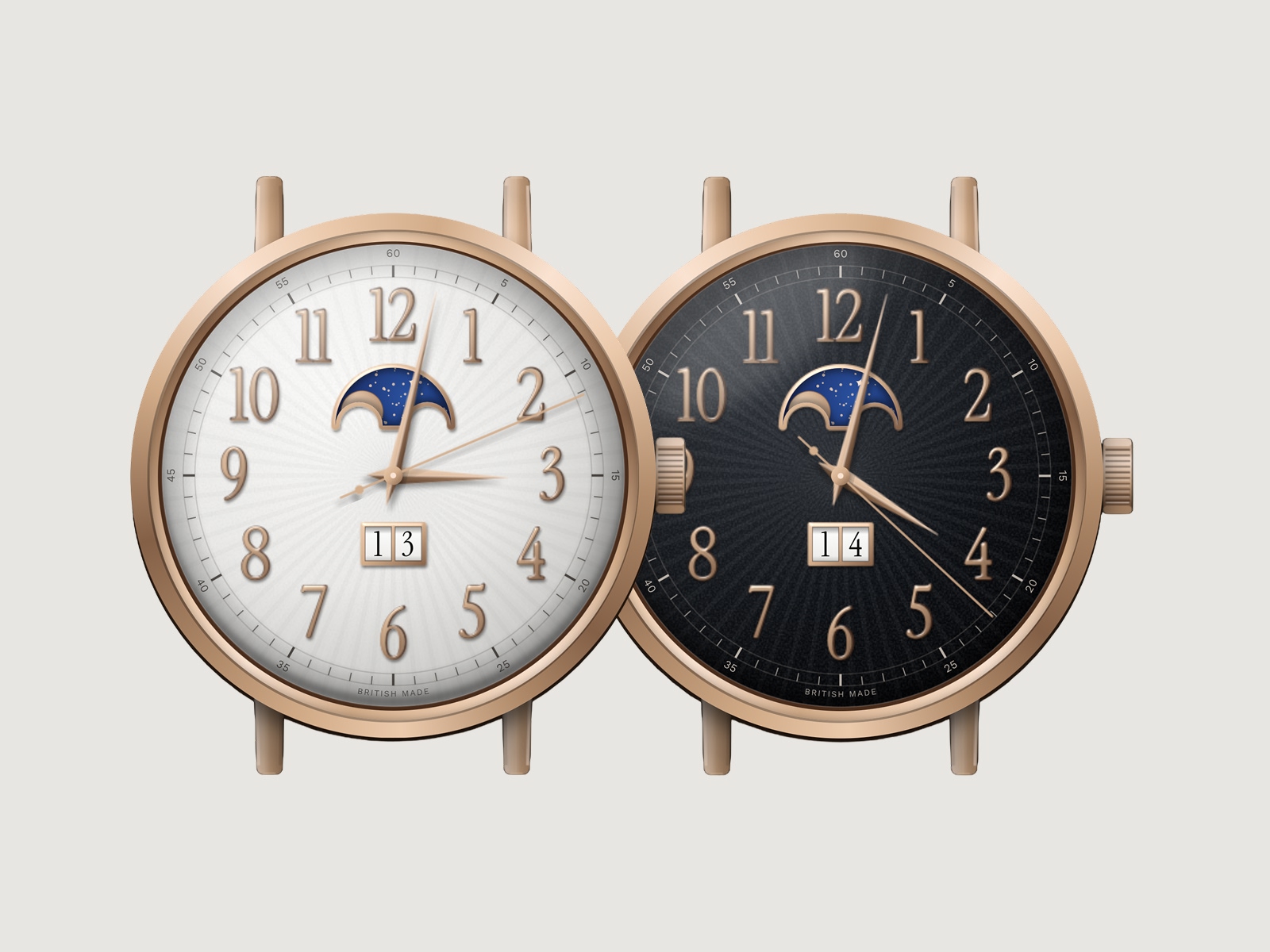
The design takes its cues from classical dress watches, with a warm rose-gold-toned case, carefully proportioned lugs and crown, applied-style Arabic numerals and an elegantly restrained arrangement of complications. The dial has a subtle radial texture, inspired by the sunray finishes found in traditional watchmaking, while the hands follow a faceted Dauphine form. Their contrasting surfaces suggest the way polished metal catches the light differently depending on its angle.
Two dial treatments provide distinctly different personalities. The darker version has a more dramatic character, with warm metallic details standing against a deep charcoal face. The lighter interpretation introduces an ivory-toned dial, allowing the same case, hands and numerals to take on a rather different appearance.
Neither is intended to imitate a particular manufacturer's watch. This was an opportunity to explore the visual language of classical horology and create something with its own character, designed specifically for the medium in which it would live.
The greatest challenge wasn't necessarily drawing the individual components. It was making them feel like parts of the same object. A date aperture that's slightly too large, a hand that's incorrectly proportioned or a moonphase display that doesn't sit comfortably within the dial can change the character of the whole piece. These are small decisions, but they're also what make watch design such an absorbing discipline.
A movement without the machinery
A static illustration would have been relatively straightforward. What interested me was giving the watch its own sense of movement.
The seconds hand travels around the dial in a continuous sweep, inspired by the flowing motion associated with a mechanical movement, rather than jumping abruptly from one second to the next. The minute and hour hands advance proportionately as time passes, so their positions remain true to the time being displayed rather than shifting in obvious increments.
It's a subtle distinction when you're looking at the watch for only a moment. Spend a little longer with it, however, and the movement becomes part of the experience.
I wanted the interaction to feel appropriate to the object, with the timing, proportions and visual behaviour working together rather than drawing unnecessary attention to the technology involved.
The calendar received similar attention. A conventional digital clock simply replaces one date with another at midnight, but I wanted the date window to reference the mechanical character of a traditional calendar watch. During the final hour of the day, the numerals begin a gradual movement, gathering pace as midnight approaches before the new date settles into place.
The two digits sit within individually framed apertures, with subtle shading suggesting the curvature and depth of the date wheels beneath the dial. It's a small piece of theatre that most visitors will probably never notice unless they happen to be looking at just the right moment.
I rather like that.
There is a particular pleasure in including a detail because it belongs to the object, not because everybody is guaranteed to see it. Watchmaking is full of such things, from movement finishing hidden beneath a caseback to the precise mechanics of a complication that might only be called upon occasionally.
The digital movement also respects the visitor's accessibility preferences. Where reduced motion is requested, the continuous sweep gives way to a more conventional, precisely timed movement. It's an important distinction: the experience should be enjoyable, but the visual effect should never take priority over somebody's comfort in using it.
The moonphase deserves a closer look
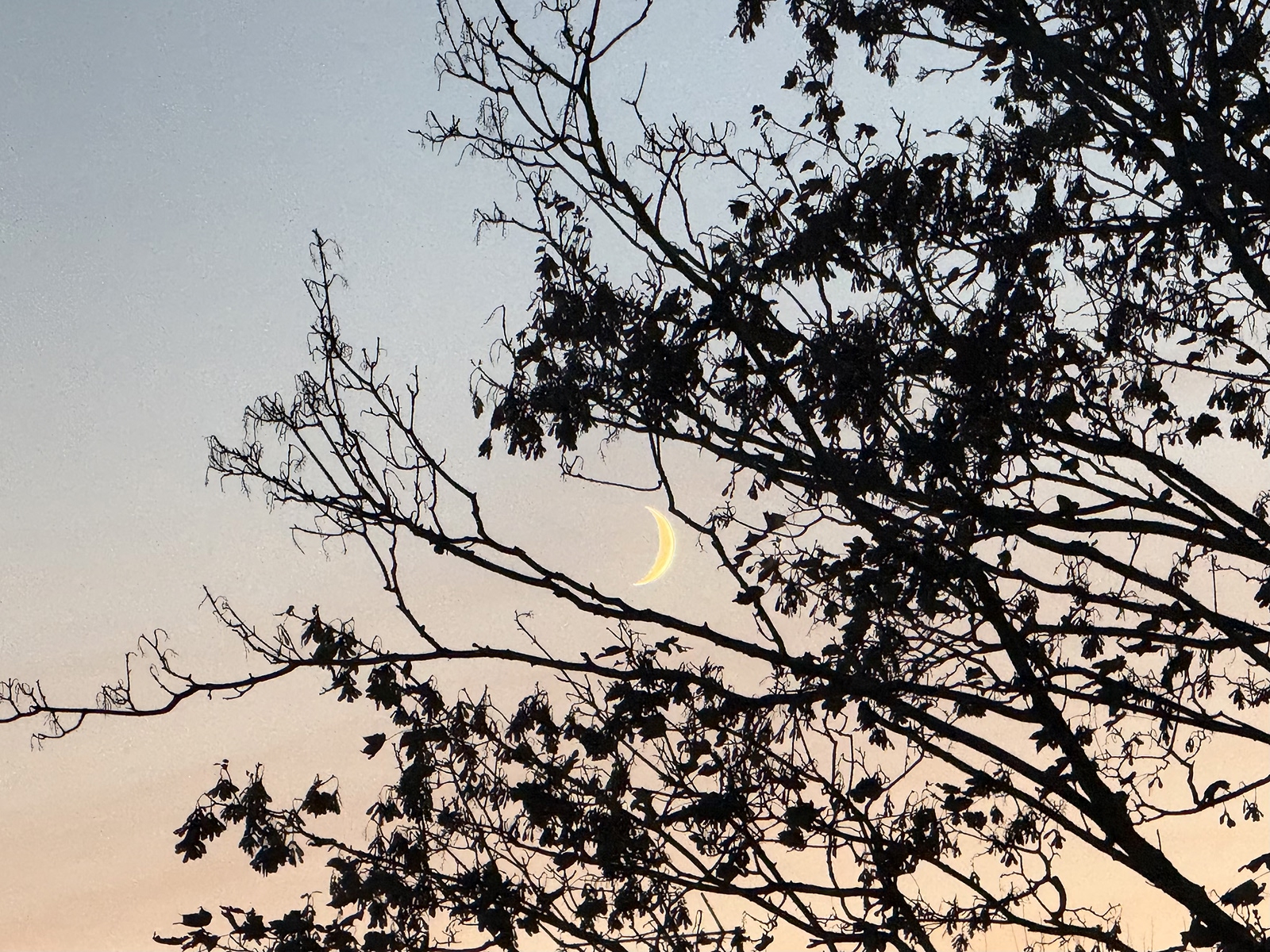
Of everything involved in this project, the moonphase complication is probably the part I enjoyed developing most.
There is something rather romantic about a mechanical watch showing the progression of the moon. It's an indication that offers relatively little practical assistance in most people's daily lives, yet it remains one of the most recognisable and appealing expressions of traditional watchmaking. Perhaps that's part of its charm. Not every complication needs to exist solely because it makes us more productive.
I wanted the moonphase to be genuinely functional rather than an attractive illustration that happened to sit above the hands.
In traditional watchmaking, a common moonphase mechanism uses a rotating disc decorated with two identical moons. The familiar arrangement employs a 59-tooth wheel, representing two lunar cycles of approximately 29½ days each. As the disc advances behind a shaped opening, the visible portion of the moon changes, creating the recognisable progression from crescent through full moon and back again.
It's an ingenious mechanical solution to the problem of representing something that moves according to an astronomical cycle.
The actual lunar month is slightly longer than 29½ days, which is why conventional mechanical moonphase displays gradually accumulate an error unless periodically corrected. More sophisticated mechanisms can achieve extraordinary accuracy, with some capable of running for many decades before requiring adjustment.
For my digital interpretation, I wanted to preserve the visual character of that traditional mechanism while using the real lunar cycle as the basis for the display.
Behind the shaped aperture is a rotating arrangement of two golden moons, following the same principle as a classical double-moon disc. The curved edges of the opening gradually conceal and reveal the moons as the cycle progresses, creating the familiar waxing and waning forms through geometry rather than a sequence of interchangeable illustrations.
The surrounding night sky takes inspiration from aventurine dials, with a deep midnight-blue appearance, delicate golden specks and small faceted stars. I particularly enjoy the contrast between that rich blue and the warmer tones of the case and hands. It gives the complication a distinctive presence without overwhelming the dial.
There's a lovely balance to this part of the design. The display references a centuries-old mechanical principle, but the astronomical calculation behind it belongs entirely to the digital world. It's a small example of how modern technology can preserve the character of something traditional while allowing it to behave in a different medium.
And unlike a decorative moon printed permanently on a watch face, this one changes as the moon does.
A little more than world time
The original purpose of the project was straightforward: to make it easier for visitors in different parts of the world to understand the time where I am, and to explore the time where they might be.
My work and interests aren't confined to one location, and I wanted the Enquire page to acknowledge that international perspective without introducing another conventional piece of interface furniture.
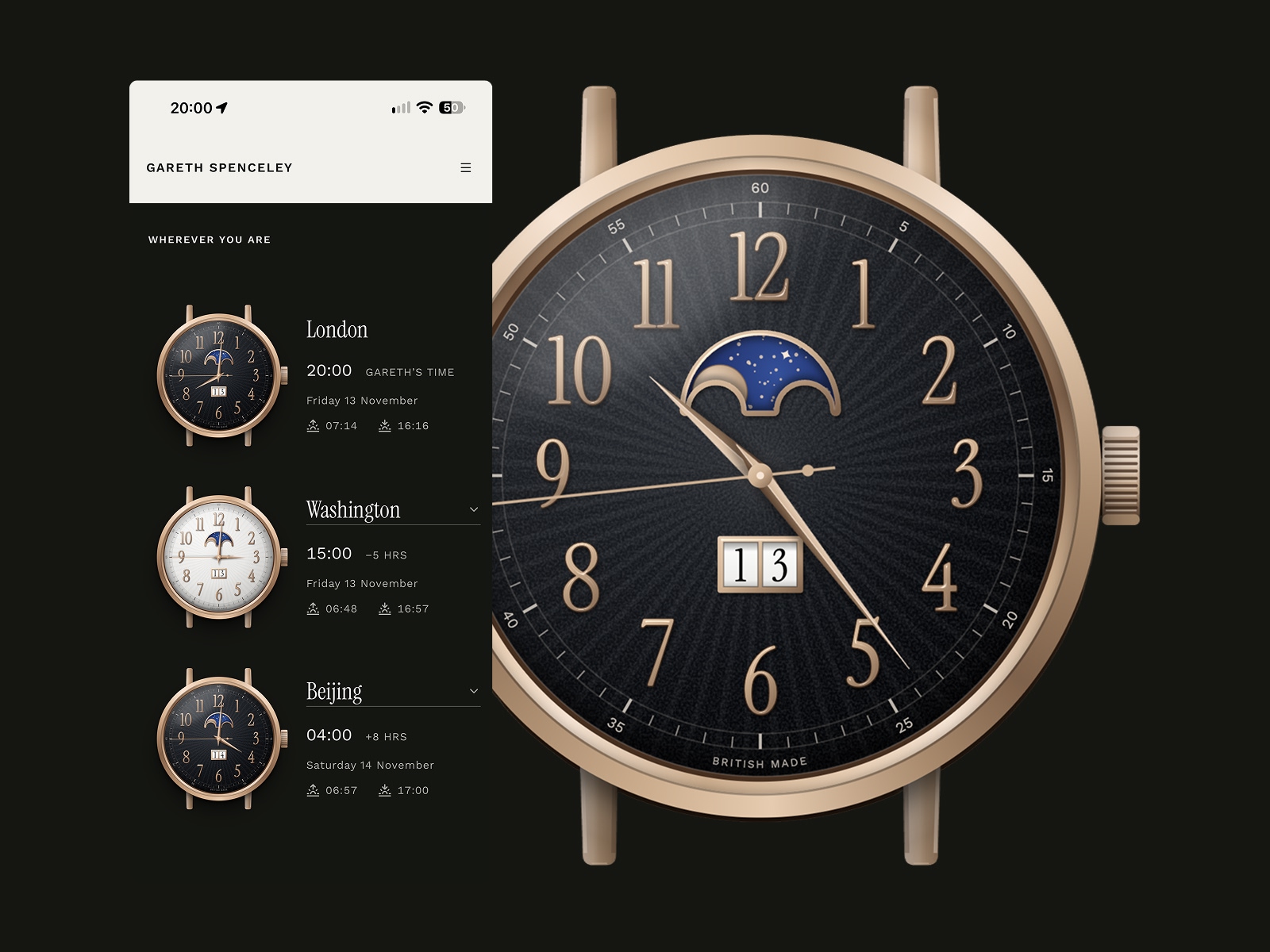
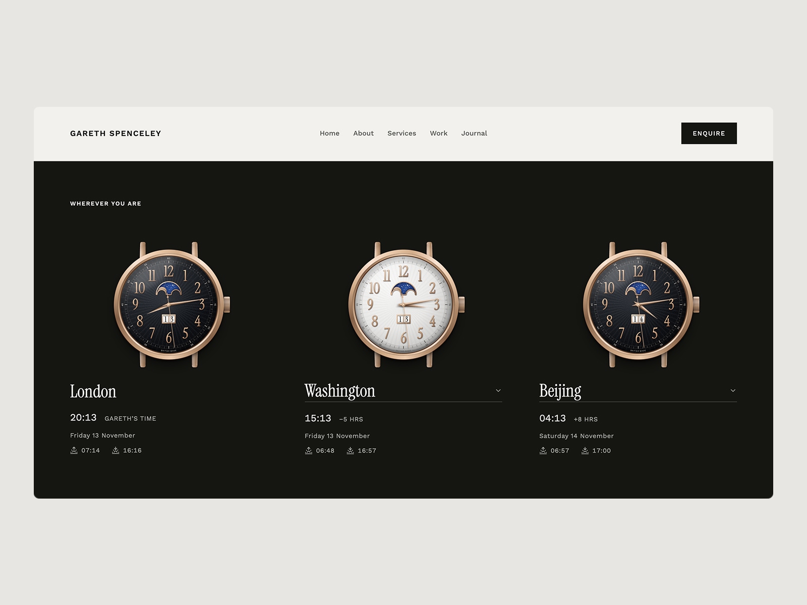
The finished experience presents three watches side by side, opening with London, Washington and Beijing. London remains the reference for my local time, while visitors can change the other destinations using a selection of 29 world capitals across Europe, the Americas, the Middle East and Asia-Pacific.
Each selection updates the corresponding watch to reflect the destination's local time and date, including the correct time-zone relationship with London. Daylight saving changes are handled automatically, which is especially important when comparing locations whose clocks change at different times of the year.
But I wanted the watches to communicate something beyond the hour.
Each destination also displays its calculated sunrise and sunset times, with the surrounding presentation responding to whether the city is currently experiencing daylight or darkness. The contrast between a pale daytime dial and a darker evening setting becomes particularly pleasing when the three watches are viewed together.
In one part of the world, somebody may be beginning their working day while I'm preparing to finish mine. Elsewhere, the date may already have moved into tomorrow. Seeing those differences expressed through familiar watch faces feels more immediate and personal than presenting a collection of numerical offsets.
There's a practical purpose behind all of this, naturally. Understanding somebody's local time is a useful courtesy when arranging a conversation across countries. But the real pleasure of the project was finding a way to make that information part of the wider personality of the website.
The experience also needed to remain accessible and useful. The city names, dates, time differences and astronomical information are presented clearly alongside the dials, so visitors aren't dependent on interpreting an analogue watch face to understand the information. The functionality remains the priority, however much care has gone into its appearance.
An exercise in getting the details right
This wasn't a client commission or an attempt to develop a commercial watch product. It was something I wanted to make for my own website, prompted by a practical opportunity and a genuine enthusiasm for the subject.
Personal projects can be particularly rewarding for that reason. They create the freedom to investigate an idea without needing every decision to justify itself against a formal brief. There's an opportunity to explore something simply because it interests you, discover the difficulties involved and develop the work until it feels complete.
That doesn't make the design decisions any less important.
Throughout the project, I wanted the result to feel coherent as both a timepiece and a digital product. The appearance needed to reward closer inspection, the movement needed to behave convincingly and the information had to remain reliable and straightforward to understand. Those requirements influenced one another throughout development, and getting them to work together was a substantial part of the enjoyment.
The finished watches are now working elements of the website rather than static images or illustrations of something that might be built in the future. The hands move, the date advances, the moonphase follows its cycle and the world-time displays respond to the cities selected.
I particularly enjoy the fact that somebody might arrive simply wanting to make an enquiry and discover something a little unexpected along the way.
The project reflects an aspect of design that has always interested me: taking the time to understand what makes an object or experience special, then working through the details necessary to do that idea justice. Whether the result is physical or digital, I think people can recognise when something has been made with genuine interest and care.
And if it encourages somebody to spend a few moments looking at the moonphase rather than immediately scrolling past, I'll regard that as time rather well spent.
Explore the working timepieces: garethspenceley.com/enquire
(I suspect this might not be the last digital watch I make...)