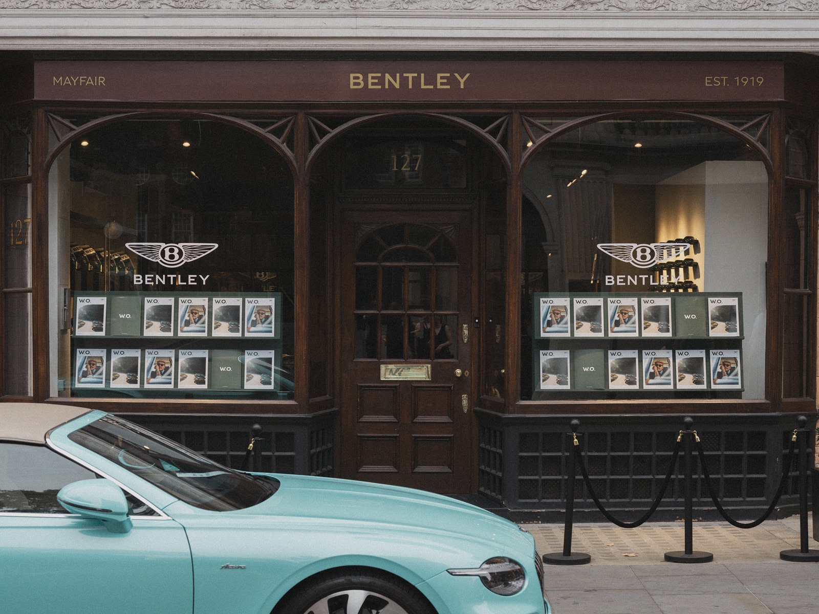
I have a longstanding admiration for Bentley. The cars, naturally, but also the attention to materials, the relationship between engineering and craftsmanship, and the extraordinary amount of work that goes into details most people will never consciously notice.
There's something rather appealing about a company that can spend so much time perfecting the experience of closing a door, selecting a piece of veneer or stitching a leather interior. So when I came across the newly relaunched W.O. Magazine, I was immediately interested. The redesign is beautiful, the photography looks exceptional and the entire project appears to have been approached with the same ambition that Bentley brings to its motor cars. My only slight frustration is that I don't actually own a Bentley, which rather limits the likelihood of a copy arriving through my letterbox.
That aside, the relaunch is one of the most interesting pieces of brand publishing I've seen recently, not simply because the magazine looks so good, but because of what Bentley has chosen to do with it. At a time when so much communication is created to be consumed quickly, measured immediately and replaced almost as soon as it appears, here is a business investing in a physical publication intended to be enjoyed at leisure and kept long after its arrival. It's a refreshing reminder that a company's relationship with its customers needn't begin and end with a transaction, and that some of the most valuable forms of communication are those that don't appear to be trying particularly hard to sell anything.
A new chapter, with a familiar name.
Bentley's customer magazine was first published in 2001 and has evolved through various editions over the past 25 years. Its latest incarnation introduces a new name, W.O. Magazine, in honour of the company's founder, Walter Owen Bentley. I particularly like that decision. There is an obvious temptation when refreshing an established publication to pursue something fashionable or unnecessarily elaborate, but the new title has a simplicity and confidence that feels entirely appropriate. It draws directly from the marque's history without making the magazine feel like an exercise in nostalgia, giving the publication an identity of its own while maintaining a natural connection to the company behind it.
The editorial direction has evolved too, with greater emphasis on the people who inhabit the Bentley world rather than simply the products themselves. Owners, enthusiasts, craftspeople and individuals whose interests extend far beyond motoring provide the stories, creating an opportunity to explore the personalities and passions that surround the marque. The first relaunched issue features actor and filmmaker Billy Zane alongside his 1990 Bentley Turbo R, while other stories travel from Tokyo to the Italian lakes. It's an appealing approach because the cars remain important without having to occupy the centre of every conversation. Bentley already has an extraordinary product to talk about, but a magazine devoted entirely to the specifications and achievements of its vehicles would offer a rather limited view of the lives and interests of the people who own them.
This shift from product information towards editorial storytelling is something I find particularly interesting from a creative perspective. The strongest publications understand that their readers have interests, ambitions and experiences that extend beyond their relationship with the organisation producing them. A reader who appreciates a beautifully engineered motor car may also have an interest in architecture, photography, travel, craftsmanship, art or the people who have achieved something remarkable within their chosen field. Giving those subjects room to breathe creates a richer publication and, in turn, a more interesting relationship between the reader and the brand. It is the difference between being repeatedly told what a company makes and being invited to explore the world of ideas and interests that surrounds it.
The beauty of something physical.
Much has been written about the decline of print, and there are perfectly sensible reasons why businesses have moved so much of their communication into digital channels. Digital publishing is immediate, accessible and wonderfully flexible, particularly when information needs to be updated regularly or shared with large audiences. But it offers a fundamentally different experience from a physical publication. A magazine has weight, texture and proportion. Its pages create a rhythm, its photography can be appreciated without competing notifications, and its presence in a room allows it to be discovered again rather than disappearing beneath the next collection of emails and social updates. The experience is slower, but that isn't necessarily a disadvantage. For the right audience and the right subject, taking time can be part of the pleasure.
Bentley appears to have embraced those qualities wholeheartedly. The new magazine has been developed with the ambition of a collectible publication, using a combination of paper stocks, a textured wrap, white foil detailing and a subtle spot UV finish. Bentley Green has been specially colour-matched, bringing a familiar element of the marque's identity into the physical production. These are details that may sound rather technical to anyone outside the world of design and print, but they have a profound influence on how a publication feels. The relationship between a cover material and the paper inside, the way a finish catches the light or the slight difference in texture as a page is turned can all contribute to an experience that is difficult to reproduce on a screen.
Having spent many years working across print and editorial design, I find that side of the project especially appealing. There is a real pleasure in developing something where the choice of paper, the scale of the photography, the typography and the finishing techniques are all part of the creative direction rather than decisions made after the design has been approved. Good print production requires an understanding of materials and processes, but it also requires judgement. A beautiful finish can elevate a publication when it has a purpose, just as an unnecessary one can make something feel overworked. The photographs released for W.O. suggest a confident approach, with generous imagery, strong typography and enough space for the content to command attention. I would love to examine a physical copy properly, because the relationship between the printed page and the object itself is clearly central to the idea.
Photography deserves room to breathe.
One of the qualities that immediately attracted me to the redesign is the emphasis placed on photography. Bentley has brought together an impressive group of creative contributors, including photographer and external creative director Greg Williams, writer and presenter Kate Peck, Road Rat editor Peter Grunert and Bentley's Head of Art Direction, Jeffrey Lee, whose previous experience includes Condé Nast and British GQ. That combination of editorial and visual expertise gives some indication of the ambition behind the project. Rather than treating the magazine as a collection of product announcements that happen to require photographs, the intention appears to be to create a publication with its own editorial personality and visual standards.
There is something particularly satisfying about photography being allowed to occupy a page with confidence. In a world where images are so frequently cropped, reduced and surrounded by competing information, a strong photograph presented at a generous scale can be remarkably powerful. It gives the reader an opportunity to notice the expression on a face, the atmosphere of a location or the detail of an object without being immediately directed towards another message. Typography and layout then become supporting elements, establishing a rhythm and providing the information necessary to make the story enjoyable. The restraint required to achieve that balance is easy to underestimate. It involves making choices about what deserves attention and having the confidence not to fill every available space.
For businesses investing in their own publications, brochures or other printed communications, that principle is just as relevant regardless of scale. Exceptional editorial design isn't simply a matter of making individual pages attractive. It requires an understanding of the audience, the character of the content and the experience of moving through the publication as a whole. The opening pages establish expectations, the pace of the imagery influences how stories are experienced, and the relationship between photography, typography and materials gives the finished piece its personality. When those elements work together, the publication feels like a coherent experience rather than a series of separate design decisions.
A newsagent in Mayfair.
As much as I admire the redesign, the way Bentley chose to introduce the magazine is perhaps the detail I find most charming. Rather than simply announcing the new issue and distributing it to customers, the company transformed Automat on Mount Street in Mayfair into the Bentley Newsagent for a week, from 28 August to 4 September 2026. Visitors could purchase a drink and receive a limited-edition copy of the magazine while stocks lasted. There is something wonderfully straightforward about the idea: a beautifully produced magazine, a coffee and a reason to spend a little time in a place that has a genuine connection to the company's history.
That connection is what makes the location so effective. Bentley's heritage collection contains a photograph from 1929 showing four Bentley racing cars and their drivers gathered on Mount Street ahead of the 24 Hours of Le Mans, an event at which Bentley would achieve a remarkable first, second, third and fourth-place finish. Almost a century later, returning to the same street to celebrate a new chapter in the company's storytelling feels like a natural continuation of that history. It gives the launch a narrative that couldn't simply be transferred to any fashionable location, and it brings together the company's past and present without relying on an elaborate recreation of either.
I admire the fact that the launch turned a piece of printed communication into a physical experience. The magazine was no longer simply something to receive through the post; for a short time, it became something to discover, collect and enjoy within a setting that had been given a particular purpose. The idea brings together editorial design, brand identity, environmental design and customer experience in a way that feels coherent rather than theatrical. It also demonstrates how much more interesting a launch can become when the thinking extends beyond the object being introduced. A relatively simple encounter can leave a lasting impression when the location, the story and the details all belong together.
The difference between communication and connection.
What I find most compelling about W.O. Magazine is that it appears to recognise something important about the relationship between a business and the people who choose it. Bentley owners already know they own a Bentley. They don't need a beautifully printed magazine to remind them of the badge on the bonnet or explain that the cars are expensive. What a publication like this can offer is a deeper connection to the people, ideas and experiences associated with the marque. It can introduce an owner to someone whose story they find fascinating, reveal a part of the company's history they hadn't encountered before or simply provide an enjoyable hour with a beautifully produced collection of photography and writing.
That distinction matters well beyond the automotive world. I've often felt that businesses can become so focused on explaining their products and services that they overlook the opportunity to create something genuinely interesting for the people they want to reach. A residential developer might have remarkable stories to tell about the architecture, landscape and craftsmanship behind a particular place. A specialist travel company may have access to people and destinations whose experiences deserve far more than a conventional brochure. An established business with a discerning customer base might have the opportunity to produce an editorial publication that customers enjoy in its own right, rather than another piece of marketing material destined for a drawer. The opportunity is not necessarily to produce more communication, but to create something with enough substance, personality and quality that people choose to spend time with it.
Of course, a publication of this ambition requires investment, and it would be unrealistic to suggest that every business should commission a magazine on the scale of Bentley's. But the underlying thinking is applicable to projects of very different sizes. A beautifully produced annual publication, an exceptional property brochure, a carefully directed campaign or even a single piece of print can benefit from the same attention to storytelling, imagery, materials and the experience of the person receiving it. The important question is not how elaborate the finished piece can become, but whether it has a worthwhile purpose and whether every creative decision helps fulfil that purpose. It's a question I enjoy exploring with clients, particularly when a project offers the opportunity to create something more memorable than the format might initially suggest.
Something worth keeping.
There is a lovely confidence in creating a publication that isn't intended to be discarded after a few minutes. It suggests that the stories are worth telling properly, that the photography deserves to be appreciated and that the reader's time is valuable enough to warrant a genuinely rewarding experience. In the case of W.O. Magazine, the quality of the physical production also feels especially appropriate to the company behind it. Bentley's reputation has been built in part upon the relationship between engineering, materials, craftsmanship and personal experience, so a magazine that expresses those same qualities through paper, photography and print feels like a natural extension of the marque.
I haven't had the pleasure of holding a copy yet, so my admiration is based on the published imagery and the details Bentley has shared about the relaunch. Even from that perspective, though, it is an inspiring example of what can happen when a business approaches its own communications with the ambition of a genuine editorial project. The redesign has character, the subject matter promises to be interesting and the Mayfair launch adds a wonderful sense of occasion. It makes me want to see the publication properly, which is probably one of the nicest things you can say about a piece of brand publishing.
I hope W.O. Magazine enjoys a long and successful future, and that its relaunch encourages more businesses to rediscover the possibilities of exceptional print. There will always be a place for immediate digital communication, but there is something special about an object that has been made with the intention of being enjoyed, returned to and kept. And if anyone at Bentley happens to have a spare copy, there is a designer in Nottinghamshire who would be absolutely delighted to give it a good home. The Bentley itself can wait.